The Redesign Process
A complete site redesign is something that most of you will probably have gone through by now. It is nearly always a daunting and formidable task to overhaul all of your existing work, but if you do it right you'll be injecting new life into your site. Detailed below are some of the changes I made to HTML Source in our most recent redesign, with practical tips that you should be able to apply to your own situation.
![]() This page was last updated on 2012-08-21
This page was last updated on 2012-08-21
Prehistory of the Source
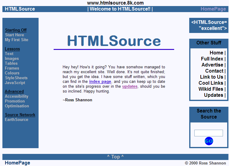
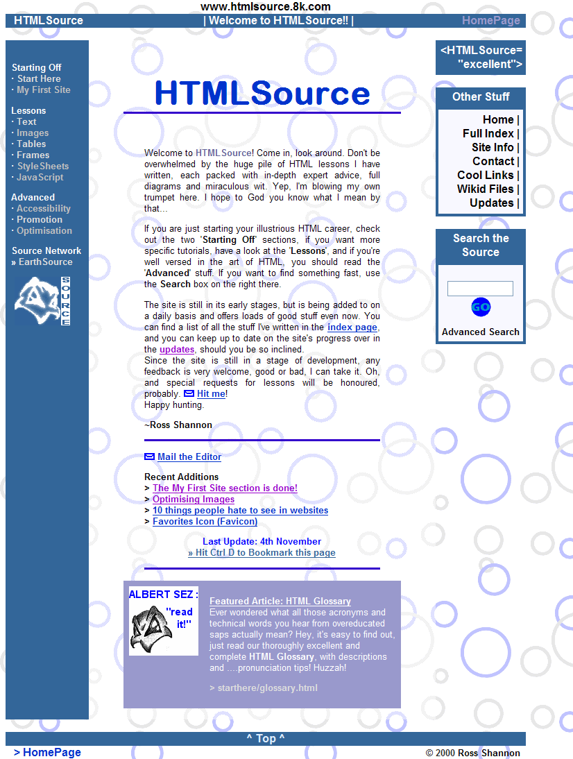
Before we get into the hows and whys of the current redesign, you should probably be given a glimpse of the older design's HTML Source has gone through. We began in the summer of 2000 with the highly dodgy Source 1 look. A shaky start, to be sure. That was really just a structure to hold the early content together, and so it was soon sheened over with a spot of colour. Giving version names to the designs is something I do, and as you can see 1.5 is a bit of a muddle. Sure, it looks much better, but it's very, very hard to read the main content (despite that clever translucency effect).
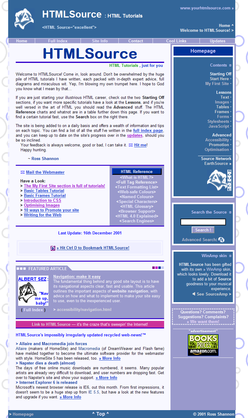
I worked with this layout for far too long, before finally getting sick of it's limitations (and numerous travesties of design), and made the large leap over to HTML Source 2. That was late in 2001, and clearly it was a move in the right direction. Still, looking back at it now with the new look still fresh in my mind, version 2 looks distinctly dirty, with an altogether too-busy atmosphere.
In truth, I wasn't thinking about redesigning at all, that is until I started reading about XHTML. So I got the crazy notion of remaking the entire site. Hey, it was only 150-odd pages, how hard could it be? I took a break from writing for a couple of weeks and just played with the design, writing down every idea that came into my head and experimenting with the placement of elements. I read a lot about » web standards, read web design sites, and found » browser usage statistics. I eventually had some concrete ideas of what needed to be addressed. Some sketching later, and I was ready.
Technology
A move to XHTML, the latest HTML specification, was the primary reason that I wanted to redesign. The concept of forward-compatibility, while relatively new to most web designers, is an important one. Performing a redesign in old-style HTML 4 would be a wasted opportunity, as the move to XHTML would have to be made eventually.
Beforehand, the site had used <font> tags, nested tables and all sorts of other redundant rubbish. Armed with the knowledge that the vast majority of people have capable browsers, along with the unquestionable evidence I have from months of visitor statistics, I felt confident that I could finally go with a completely stylesheet-powered site. The benefits of using CSS are much publicised. I was going to code cleanly, using logical tags, and no hacks so that the content would stay accessible to any viewer, even if their browser didn't support stylesheets properly.
After a few false starts, I finally managed to remake the site’s previous table-based design using CSS for layout exclusively. This gave me loads of flexibility in working with spacing and text formatting in the design. Using CSS speeds the pages up universally too; plus we were moving to a high-performance server, so things were going to go like zip...
The Changes
Now we get onto the specific changes I made to the layout. I wanted to move things around a bit, so that elements would be used in the best way. While the old layout had introduced many of the parts of the layout which remain today, they were placed in the wrong areas of the page, and so probably weren't seeing the use that they could. Now I had the opportunity to set this right. Open a » Source 2 tutorial in another browser window while you read through this so you can see what I'm talking about. And note that while this may all seem like HTML Source-specific information, you will be able to pick up on general tips applicable to your site.
The Search box
I distinctly remember this being the first change I wanted to make. I wanted to make the search box more visible, and so moved it up to the standard top-right position on the page. Its old position under the main navigation meant many readers probably overlooked it, especially those with small monitors. From this new vantage point, it should be used more and so readers will be able to find what they want without giving up. When you load the page it's now one of the first things you notice, a plus for any search function. The advanced search's prominence was toned down a little, on the realisation that it is a feature that most readers will never use.
Breadcrumb Trail
Moving the search box to the top meant that the path bar didn't have a place to stay. While I liked the vertical style I had made up, a horizontal breadcrumb trail is more standard, so I switched to that. Plugging the url is a trick I've used for a while, and I was able to integrate that into the nicely terse path bar. Usability was on the up!
Page Background
Of the few complaints I have received about HTML Source, the background was always a major bone of contention. I loved it, a few readers wished it would go away. So, just as an experiment I lightened it in my graphics editor and used it for a few days. It was clearly a better choice — it put the focus on the content in the centre and made reading the page easier as there was less peripheral distraction. Now that I look back I can see that the old background was really bad; funny how some mistakes only become apparent after you fix them by accident.
Logical Structure
I never used headings before — they were ugly and spaced things out far too much. Now that I had CSS at my disposal however, I could use the power of headings — that is, creating proper document outlines and increased readability — and have them look exactly as I wanted. Documents are now much better structured with headings and subheadings, meaning scanning is facilitated.
I also started to use logical elements like <strong>, <em>, <code> and <acronym>. Using bold tags is a far inferior method to strong, and as I wasn't using presentational elements anymore all the <b> tags had to be converted to <strong>. This isn't as laborious as it sounds, with a good Find & Replace feature in your HTML editor it can be done site-wide in a minute.
Adding supplementary information in the title of acronyms and abbreviations gives an extra level of depth to the tutorials, and increases understanding. This did take time to implement, but I believe it's been worth it.
Typography
Readability was a concern that was rising in my mind for a while, and now that I was using CSS for typography I could go to town on effects to help make reading the content easier. First of all I'm using relative font sizing everywhere so that you can resize the text if it's not to your liking. I've used leading to make reading blocks of text infinitely easier. More white space, proper headings, more paragraphs and a greater propensity to use lists meant longer passages are more easily read.
I also started using better punctuation through character entities — mainly the full em-dash. This is a difficult change to make due to the large amount of writing that has to be re-edited, so this is a change I'm bringing in gradually.
Page Navigation
The Other Articles and What's Related areas, which had been part of the side navigation bar under the search box are now placed at the bottom of the content. This is a far better position, as it is when the article is finished that you want somewhere else to go, so this is the logical place for a group of links to related pages. Keep Learning, which had before been a link I had added to only some pages, was promoted to a standard page element, for better congruency. This linear navigational element means it's easy to move forward through the whole set of pages. Links to pages in other sections are given almost as much prominence as other pages from the section in use to promote movement around the site.
Also, redundant links like 'Home' and 'Contents' were dropped from the navigational areas to make things simpler. Having three ways to go to the same page all adjacent to each other seemed a little pointless. The current navigation gets to the point quicker, and conveys the structure in a way that is easier to understand.
More Resources, the box in the sidebar that contains general links to other websites has been given some extra prominence. I'm going to be adding in more external links and beefing up the existing tutorials in this area to offer more resource value all 'round; having come to the realisation that linking to other sites is a pretty safe thing to do. Most people will not just forsake HTML Source — they'll apreciate well-chosen links to further information; but will build up a mental image of this site as, yes, their source of content. It's all about the branding.